Brand Havan

brandhavan-ezgif.com-resize.gif
 

We help brands.

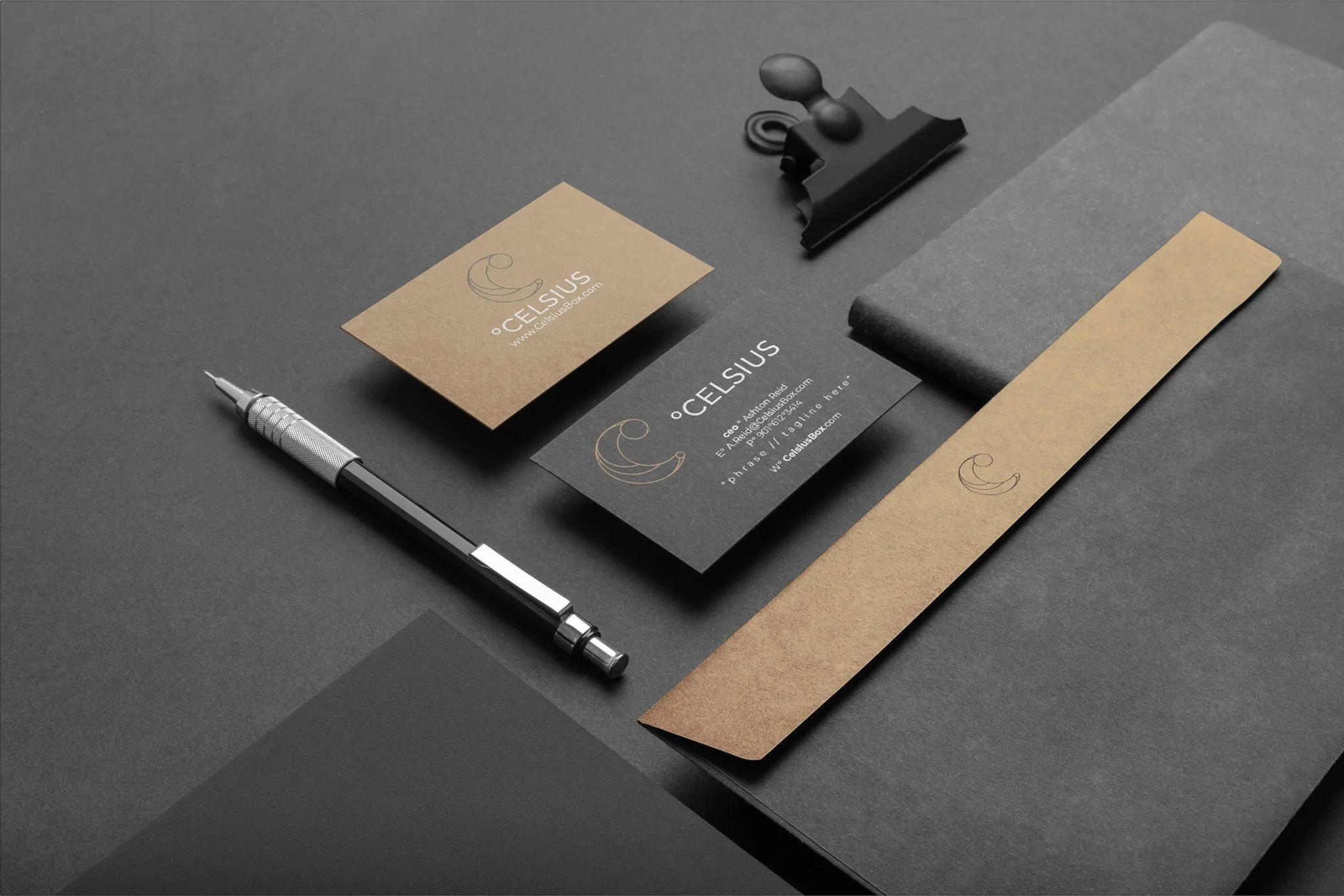
We help brands become the most premium-looking option in their market.Through cinematic film, strategic design, and conversion-driven creative systems, we position companies to attract higher-value clients and close more premium work.
View Our Recent WORK and our Case Studies

DESIGN

Forward

Brand Havan stage on stage logo design.png

We build perception systems that increase value perception:

Our Creativity, Your Tone


Most brands don’t struggle with quality of work.
They struggle with how they are perceived. You can be great and still look average online.
And average-looking brands compete on price.


ATTENTION

2026+


Our work helps brands:

Increase perceived pricing power

  • Attract higher-quality inbound leads

  • Improve conversion from attention to inquiry

  • Stand out in saturated markets

Brand%2BHavan%2B-%2BCopywriting%2Bcreativity%2B.jpg

ATTENTION

2026+

How we think about creative

Good creative doesn’t just look polished it creates alignment between:

  • what you do

  • how you’re perceived

  • and what people are willing to pay

That’s where real brand value is built.

Every project is designed to do one thing:
make your brand feel like the obvious choice in your category.

Not louder. Not trendier. Just unmistakably right.


Why BrandHavan

You don’t need more content. You need a brand that actually means something to the people you’re trying to reach. That’s where we come in.

At BrandHavan, we don’t treat creative as decoration we treat it as a system for perception, trust, and growth.

We help brands become:

  • clearer in what they stand for

  • stronger in how they’re perceived

  • and more effective in how they convert attention into action

Because in today’s market, attention isn’t the problem clarity is. Most brands look “fine.”
But “fine” doesn’t build authority, and it definitely doesn’t command premium pricing. We build creative systems that close that gap.

 
Believe The Hype.jpg

What To Do in

2026

Make it POP! Make it stand out.


What Changes When We Step In

Most brands don’t need more content. They need clearer perception. When we work with a brand, the goal isn’t to “make things look better” it’s to make your business feel more valuable the moment someone encounters it. That shift changes everything.

Your brand starts to:

  • command more attention without chasing it

  • feel more established in a crowded market

  • attract clients who already believe in the value before the conversation starts

Because in 2026 and beyond, design isn’t decoration it’s positioning.

 
brandhavandigitalagencyvideomotiongraphicscreatiovedirectoragency-gif.gif

Helping Brands Evolve Since

2010


Helping Brands WIN

We’ve spent over a decade helping brands refine how they show up in the world—through design, film, and strategic creative direction. What we’ve learned is simple: Strong brands don’t compete for attention. They earn recognition.

And recognition changes everything.

If you’re here You’re likely not looking for “more content.”

You’re looking for:

  • better positioning

  • stronger perception

  • and a brand that matches the level you’re operating at

That’s where we come in!

Ready to take your brand to the next level? Contact us now to get started!

→ Settings → Advanced → Code Injection → Header 2. All HTML → Code Block on page 3. → Code Injection → Footer To hide Squarespace's native header on this page, add to Header Code Injection: .Header,.header-display-desktop, #header{display:none!important} body{padding-top:0!important} ───────────────────────────────────────── */ :root { --white: #FFFFFF; --off-white: #F8F8F6; --black: #111111; --ink: #1C1C1C; --gray-50: #F2F2F2; --gray-100: #E5E5E5; --gray-300: #AAAAAA; --gray-500: #666666; --blue: #9AB5C5; --blue-mid: #6B96AF; --serif: 'Cormorant Garamond', Georgia, serif; --display: 'Space Grotesk', system-ui, sans-serif; --body: 'DM Sans', system-ui, sans-serif; --ease: cubic-bezier(0.16, 1, 0.3, 1); --ease-in-out: cubic-bezier(0.76, 0, 0.24, 1); } *, *::before, *::after { box-sizing: border-box; margin: 0; padding: 0; } html { scroll-behavior: smooth; -webkit-font-smoothing: antialiased; } body { background: var(--white); color: var(--black); font-family: var(--body); font-weight: 300; line-height: 1.6; overflow-x: hidden; } img { display: block; max-width: 100%; height: auto; } a { text-decoration: none; color: inherit; } ul { list-style: none; } button { border: none; background: none; cursor: pointer; font-family: inherit; } /* ── LOADER ── */ #bh-loader { position: fixed; inset: 0; background: var(--black); z-index: 9999; display: flex; flex-direction: column; align-items: center; justify-content: center; gap: 1.8rem; transition: transform 1s var(--ease-in-out); } #bh-loader.bh-out { transform: translateY(-100%); } .bh-ldr-logo { font-family: var(--display); font-size: clamp(1.6rem, 3.5vw, 3rem); font-weight: 300; letter-spacing: 0.5em; text-transform: uppercase; color: var(--white); opacity: 0; transform: translateY(18px); transition: opacity 0.7s ease, transform 0.7s ease; } .bh-ldr-logo.bh-on { opacity: 1; transform: translateY(0); } .bh-ldr-sub { font-family: var(--body); font-size: 0.65rem; font-weight: 300; letter-spacing: 0.4em; text-transform: uppercase; color: var(--blue); opacity: 0; transition: opacity 0.5s ease 0.4s; } .bh-ldr-sub.bh-on { opacity: 1; } .bh-ldr-progress { position: absolute; bottom: 0; left: 0; height: 1px; background: var(--blue); width: 0; transition: width 2.2s ease; } .bh-ldr-progress.bh-on { width: 100%; } /* ── NAV ── */ #bh-nav { position: fixed; top: 0; left: 0; right: 0; z-index: 1000; display: flex; align-items: center; justify-content: space-between; padding: 1.6rem 3rem; transition: background 0.4s ease, padding 0.4s ease, border-color 0.4s ease; border-bottom: 1px solid transparent; } #bh-nav.bh-solid { background: var(--white); padding: 1.1rem 3rem; border-bottom-color: var(--gray-100); } .bh-nav-logo { font-family: var(--display); font-size: 0.95rem; font-weight: 500; letter-spacing: 0.22em; text-transform: uppercase; color: var(--white); transition: color 0.4s ease; } #bh-nav.bh-solid .bh-nav-logo { color: var(--black); } .bh-nav-links { display: flex; align-items: center; gap: 2.4rem; } .bh-nav-links a { font-family: var(--body); font-size: 0.7rem; font-weight: 400; letter-spacing: 0.18em; text-transform: uppercase; color: rgba(255,255,255,0.75); transition: color 0.3s ease; position: relative; } .bh-nav-links a::after { content: ''; position: absolute; bottom: -2px; left: 0; height: 1px; width: 0; background: var(--blue); transition: width 0.3s ease; } .bh-nav-links a:hover { color: var(--white); } .bh-nav-links a:hover::after { width: 100%; } #bh-nav.bh-solid .bh-nav-links a { color: var(--gray-500); } #bh-nav.bh-solid .bh-nav-links a:hover { color: var(--black); } .bh-nav-cta { font-family: var(--body); font-size: 0.68rem; font-weight: 400; letter-spacing: 0.16em; text-transform: uppercase; color: var(--black) !important; background: var(--white); padding: 0.6rem 1.3rem; transition: background 0.3s ease, color 0.3s ease !important; } .bh-nav-cta::after { display: none !important; } #bh-nav.bh-solid .bh-nav-cta { background: var(--black); color: var(--white) !important; } .bh-nav-cta:hover { background: var(--blue) !important; color: var(--black) !important; } .bh-hamburger { display: none; color: var(--white); transition: color 0.4s ease; padding: 4px; } #bh-nav.bh-solid .bh-hamburger { color: var(--black); } /* Mobile overlay */ #bh-mob { position: fixed; inset: 0; background: var(--black); z-index: 998; display: flex; flex-direction: column; align-items: center; justify-content: center; gap: 2rem; opacity: 0; pointer-events: none; transition: opacity 0.35s ease; } #bh-mob.bh-open { opacity: 1; pointer-events: all; } .bh-mob-close { position: absolute; top: 1.6rem; right: 2rem; font-size: 1.8rem; color: var(--white); cursor: pointer; font-family: var(--display); font-weight: 200; } .bh-mob-links a { display: block; font-family: var(--display); font-size: clamp(2.2rem, 6vw, 4rem); font-weight: 300; color: var(--white); letter-spacing: -0.01em; text-align: center; padding: 0.3rem 0; transition: color 0.25s ease; } .bh-mob-links a:hover { color: var(--blue); } /* ── HERO ── */ #bh-hero { position: relative; height: 100vh; min-height: 640px; overflow: hidden; display: flex; align-items: flex-end; } .bh-hero-slides { position: absolute; inset: 0; } .bh-hero-slide { position: absolute; inset: 0; background-size: cover; background-position: center; opacity: 0; transform: scale(1.03); transition: opacity 1.4s ease, transform 8s ease; } .bh-hero-slide.bh-on { opacity: 1; transform: scale(1); } .bh-hero-veil { position: absolute; inset: 0; background: linear-gradient( to bottom, rgba(0,0,0,0.08) 0%, rgba(0,0,0,0.04) 35%, rgba(0,0,0,0.72) 100% ); } .bh-hero-body { position: relative; z-index: 2; padding: 0 3.5rem 5.5rem; max-width: 960px; } .bh-eyebrow { font-family: var(--body); font-size: 0.62rem; font-weight: 400; letter-spacing: 0.42em; text-transform: uppercase; display: block; margin-bottom: 1.4rem; } .bh-hero-body .bh-eyebrow { color: var(--blue); opacity: 0; transform: translateY(12px); transition: opacity 0.7s ease 0.6s, transform 0.7s ease 0.6s; } .bh-hero-h1 { font-family: var(--display); font-size: clamp(2.8rem, 6.5vw, 7.5rem); font-weight: 300; line-height: 1.0; letter-spacing: -0.025em; color: var(--white); margin-bottom: 1.6rem; opacity: 0; transform: translateY(20px); transition: opacity 0.9s ease 0.8s, transform 0.9s ease 0.8s; } .bh-hero-h1 em { font-family: var(--serif); font-style: italic; font-weight: 300; letter-spacing: 0; } .bh-hero-p { font-family: var(--body); font-size: clamp(0.85rem, 1.2vw, 0.95rem); font-weight: 300; color: rgba(255,255,255,0.72); max-width: 520px; line-height: 1.85; margin-bottom: 2.5rem; opacity: 0; transform: translateY(12px); transition: opacity 0.8s ease 1s, transform 0.8s ease 1s; } .bh-hero-actions { display: flex; align-items: center; gap: 1.5rem; flex-wrap: wrap; opacity: 0; transform: translateY(10px); transition: opacity 0.7s ease 1.18s, transform 0.7s ease 1.18s; } .bh-hero-body.bh-on .bh-eyebrow, .bh-hero-body.bh-on .bh-hero-h1, .bh-hero-body.bh-on .bh-hero-p, .bh-hero-body.bh-on .bh-hero-actions { opacity: 1; transform: translateY(0); } /* Scroll indicator */ .bh-scroll-hint { position: absolute; bottom: 2.5rem; right: 3.5rem; z-index: 2; display: flex; flex-direction: column; align-items: center; gap: 0.7rem; } .bh-scroll-hint span { font-family: var(--body); font-size: 0.55rem; letter-spacing: 0.38em; text-transform: uppercase; color: rgba(255,255,255,0.4); writing-mode: vertical-rl; } .bh-scroll-line { width: 1px; height: 48px; background: linear-gradient(to bottom, rgba(255,255,255,0.3), transparent); animation: bh-pulse 2.2s ease-in-out infinite; } @keyframes bh-pulse { 0%,100%{transform:scaleY(1);opacity:.4} 50%{transform:scaleY(.55);opacity:.9} } /* ── BUTTONS ── */ .bh-btn-primary { font-family: var(--body); font-size: 0.7rem; font-weight: 400; letter-spacing: 0.2em; text-transform: uppercase; display: inline-flex; align-items: center; gap: 0.6rem; padding: 0.85rem 1.8rem; background: var(--white); color: var(--black); transition: background 0.3s ease, color 0.3s ease, gap 0.3s ease; } .bh-btn-primary:hover { background: var(--blue); color: var(--black); gap: 0.9rem; } .bh-btn-ghost-w { font-family: var(--body); font-size: 0.7rem; font-weight: 400; letter-spacing: 0.2em; text-transform: uppercase; display: inline-flex; align-items: center; gap: 0.6rem; padding: 0.85rem 1.8rem; border: 1px solid rgba(255,255,255,0.35); color: rgba(255,255,255,0.75); transition: border-color 0.3s ease, color 0.3s ease, gap 0.3s ease; } .bh-btn-ghost-w:hover { border-color: var(--white); color: var(--white); gap: 0.9rem; } .bh-btn-ghost-b { font-family: var(--body); font-size: 0.7rem; font-weight: 400; letter-spacing: 0.2em; text-transform: uppercase; display: inline-flex; align-items: center; gap: 0.6rem; padding: 0.85rem 1.8rem; border: 1px solid rgba(0,0,0,0.2); color: var(--gray-500); transition: border-color 0.3s ease, color 0.3s ease, gap 0.3s ease; } .bh-btn-ghost-b:hover { border-color: var(--black); color: var(--black); gap: 0.9rem; } .bh-btn-solid-dark { font-family: var(--body); font-size: 0.72rem; font-weight: 400; letter-spacing: 0.18em; text-transform: uppercase; display: inline-flex; align-items: center; gap: 0.6rem; padding: 1.1rem 2.4rem; background: var(--white); color: var(--black); transition: background 0.3s ease, gap 0.3s ease; } .bh-btn-solid-dark:hover { background: var(--blue); gap: 0.9rem; } /* ── MARQUEE ── */ .bh-marquee-wrap { background: var(--black); border-top: 1px solid rgba(255,255,255,0.06); border-bottom: 1px solid rgba(255,255,255,0.06); padding: 0.95rem 0; overflow: hidden; } .bh-marquee-track { display: flex; animation: bh-mq 32s linear infinite; white-space: nowrap; } .bh-marquee-track span { font-family: var(--body); font-size: 0.62rem; font-weight: 300; letter-spacing: 0.32em; text-transform: uppercase; color: rgba(255,255,255,0.3); padding-right: 0; } .bh-marquee-track .bh-dot { color: var(--blue); padding: 0 1.4rem; } @keyframes bh-mq { from{transform:translateX(0)} to{transform:translateX(-50%)} } /* ── LAYOUT HELPERS ── */ .bh-wrap { max-width: 1260px; margin: 0 auto; } .bh-section { padding: 8rem 3.5rem; } .bh-section-sm { padding: 5rem 3.5rem; } .bh-rule { width: 32px; height: 1px; background: var(--blue); margin: 2rem 0; } /* Reveal */ .r { opacity: 0; transform: translateY(28px); transition: opacity 0.9s var(--ease), transform 0.9s var(--ease); } .r.in { opacity: 1; transform: translateY(0); } .d1{transition-delay:.08s} .d2{transition-delay:.16s} .d3{transition-delay:.24s} .d4{transition-delay:.34s} .d5{transition-delay:.44s} .d6{transition-delay:.55s} /* ── POSITIONING ── */ #bh-pos { background: var(--white); border-bottom: 1px solid var(--gray-100); } .bh-pos-grid { display: grid; grid-template-columns: 1fr 1fr; gap: 6rem; align-items: start; } .bh-pos-h2 { font-family: var(--display); font-size: clamp(2.2rem, 4.5vw, 5rem); font-weight: 300; line-height: 1.08; letter-spacing: -0.025em; color: var(--black); } .bh-pos-h2 em { font-family: var(--serif); font-style: italic; font-weight: 300; letter-spacing: 0; } .bh-pos-right { padding-top: 2.5rem; } .bh-pos-body { font-family: var(--body); font-size: 0.95rem; font-weight: 300; line-height: 1.9; color: var(--gray-500); } .bh-pos-body p+p { margin-top: 1.1rem; } .bh-stats { display: flex; gap: 3rem; margin-top: 3.5rem; padding-top: 2rem; border-top: 1px solid var(--gray-100); } .bh-stat-n { font-family: var(--display); font-size: 2.6rem; font-weight: 300; letter-spacing: -0.03em; color: var(--black); line-height: 1; } .bh-stat-l { font-family: var(--body); font-size: 0.62rem; letter-spacing: 0.22em; text-transform: uppercase; color: var(--blue-mid); margin-top: 0.35rem; } /* ── SERVICES ── */ #bh-svc { background: var(--black); } #bh-svc .bh-eyebrow { color: var(--blue); } .bh-svc-h2 { font-family: var(--display); font-size: clamp(2rem, 4vw, 4.5rem); font-weight: 300; line-height: 1.08; letter-spacing: -0.025em; color: var(--white); margin-bottom: 5rem; } .bh-svc-h2 em { font-family: var(--serif); font-style: italic; letter-spacing: 0; } .bh-svc-list { border-top: 1px solid rgba(255,255,255,0.08); } .bh-svc-item { display: grid; grid-template-columns: 3rem 1fr 1fr auto; gap: 2rem; align-items: center; padding: 2.2rem 0; border-bottom: 1px solid rgba(255,255,255,0.08); transition: background 0.3s ease; cursor: default; } .bh-svc-item:hover { background: rgba(255,255,255,0.02); } .bh-svc-num { font-family: var(--display); font-size: 0.72rem; font-weight: 300; color: var(--blue); letter-spacing: 0.1em; } .bh-svc-name { font-family: var(--display); font-size: clamp(1.1rem, 2vw, 1.6rem); font-weight: 300; color: var(--white); letter-spacing: -0.01em; } .bh-svc-desc { font-family: var(--body); font-size: 0.85rem; font-weight: 300; color: rgba(255,255,255,0.4); line-height: 1.75; } .bh-svc-arrow { font-family: var(--body); font-size: 0.65rem; letter-spacing: 0.2em; text-transform: uppercase; color: rgba(255,255,255,0.25); white-space: nowrap; transition: color 0.3s ease, letter-spacing 0.3s ease; } .bh-svc-item:hover .bh-svc-arrow { color: var(--blue); letter-spacing: 0.3em; } /* ── WORK ── */ #bh-work { background: var(--white); } .bh-work-top { display: flex; align-items: flex-end; justify-content: space-between; margin-bottom: 3.5rem; gap: 2rem; flex-wrap: wrap; } .bh-work-h2 { font-family: var(--display); font-size: clamp(1.8rem, 3.5vw, 3.8rem); font-weight: 300; letter-spacing: -0.02em; color: var(--black); line-height: 1.1; } .bh-work-h2 em { font-family: var(--serif); font-style: italic; } .bh-filters { display: flex; gap: 0; flex-wrap: wrap; } .bh-f { font-family: var(--body); font-size: 0.62rem; font-weight: 400; letter-spacing: 0.2em; text-transform: uppercase; color: var(--gray-300); padding: 0.6rem 1.1rem; border: 1px solid var(--gray-100); margin-right: -1px; transition: all 0.25s ease; } .bh-f.bh-on, .bh-f:hover { color: var(--white); background: var(--black); border-color: var(--black); z-index: 1; } .bh-f.bh-on { background: var(--black); border-color: var(--black); } /* Featured editorial */ .bh-feat { display: grid; grid-template-columns: 1.35fr 1fr; gap: 0.75rem; margin-bottom: 0.75rem; } .bh-feat-main { aspect-ratio: 4/3; } .bh-feat-col { display: flex; flex-direction: column; gap: 0.75rem; } .bh-feat-col .bh-wi { flex: 1; } /* Grid */ .bh-grid { display: grid; grid-template-columns: repeat(3, 1fr); gap: 0.75rem; } .bh-wi { position: relative; overflow: hidden; background: var(--gray-50); aspect-ratio: 3/4; } .bh-wi.bh-wide { grid-column: span 2; aspect-ratio: 16/7; } .bh-wi img { width: 100%; height: 100%; object-fit: cover; transition: transform 0.7s var(--ease); } .bh-wi:hover img { transform: scale(1.05); } .bh-wi-ov { position: absolute; inset: 0; background: rgba(17,17,17,0); display: flex; align-items: flex-end; padding: 1.4rem; transition: background 0.4s ease; } .bh-wi:hover .bh-wi-ov { background: rgba(17,17,17,0.65); } .bh-wi-info { opacity: 0; transform: translateY(8px); transition: opacity 0.35s ease, transform 0.35s ease; } .bh-wi:hover .bh-wi-info { opacity: 1; transform: translateY(0); } .bh-wi-cat { font-family: var(--body); font-size: 0.58rem; letter-spacing: 0.3em; text-transform: uppercase; color: var(--blue); } .bh-wi-title { font-family: var(--display); font-size: 1rem; font-weight: 300; color: var(--white); margin-top: 0.15rem; letter-spacing: -0.01em; } /* Hidden state for filter */ .bh-wi.bh-hide { opacity: 0; pointer-events: none; transform: scale(0.98); transition: opacity 0.35s ease, transform 0.35s ease; } /* ── EDITORIAL SPLIT ROWS ── */ .bh-ed-row { display: grid; grid-template-columns: 1fr 1fr; min-height: 68vh; } .bh-ed-row.bh-flip > *:first-child { order: 2; } .bh-ed-row.bh-flip > *:last-child { order: 1; } .bh-ed-img { overflow: hidden; } .bh-ed-img img { width: 100%; height: 100%; object-fit: cover; transition: transform 0.9s var(--ease); } .bh-ed-row:hover .bh-ed-img img { transform: scale(1.04); } .bh-ed-txt { display: flex; flex-direction: column; justify-content: center; padding: 5rem 4.5rem; background: var(--white); } .bh-ed-txt.bh-dark { background: var(--black); } .bh-ed-h3 { font-family: var(--display); font-size: clamp(1.6rem, 2.8vw, 2.8rem); font-weight: 300; line-height: 1.15; letter-spacing: -0.02em; color: var(--black); } .bh-ed-txt.bh-dark .bh-ed-h3 { color: var(--white); } .bh-ed-h3 em { font-family: var(--serif); font-style: italic; } .bh-ed-p { font-family: var(--body); font-size: 0.88rem; font-weight: 300; line-height: 1.85; color: var(--gray-500); max-width: 400px; margin-top: 1.5rem; } .bh-ed-txt.bh-dark .bh-ed-p { color: rgba(255,255,255,0.45); } .bh-ed-txt .bh-rule { margin: 1.5rem 0; } /* ── WHY SECTION ── */ #bh-why { background: var(--black); } #bh-why .bh-eyebrow { color: var(--blue); } .bh-why-grid { display: grid; grid-template-columns: 1fr 1fr; gap: 7rem; align-items: start; } .bh-why-pull { font-family: var(--serif); font-size: clamp(1.6rem, 2.8vw, 2.6rem); font-style: italic; font-weight: 300; color: var(--white); line-height: 1.35; margin-bottom: 2rem; } .bh-why-pull strong { font-family: var(--display); font-style: normal; font-weight: 300; color: var(--blue); } .bh-why-body { font-family: var(--body); font-size: 0.9rem; font-weight: 300; line-height: 1.9; color: rgba(255,255,255,0.45); } .bh-why-body p+p { margin-top: 0.9rem; } .bh-bullets { margin-top: 2.5rem; display: flex; flex-direction: column; gap: 1.4rem; } .bh-bullet { display: flex; gap: 1.2rem; align-items: flex-start; } .bh-bull-mark { width: 16px; height: 16px; min-width: 16px; border: 1px solid var(--blue); display: flex; align-items: center; justify-content: center; margin-top: 3px; } .bh-bull-mark::after { content:''; width:5px; height:5px; background:var(--blue); } .bh-bull-txt { font-family: var(--body); font-size: 0.85rem; font-weight: 300; color: rgba(255,255,255,0.5); line-height: 1.75; } .bh-bull-txt strong { color: var(--white); font-weight: 400; } .bh-why-imgs { position: relative; } .bh-why-img-main { width: 100%; aspect-ratio: 3/4; object-fit: cover; } .bh-why-img-accent { position: absolute; bottom: -2.5rem; left: -2.5rem; width: 54%; aspect-ratio: 1; object-fit: cover; border: 5px solid var(--black); } /* ── PROOF ── */ #bh-proof { background: var(--off-white); border-top: 1px solid var(--gray-100); border-bottom: 1px solid var(--gray-100); } .bh-proof-head { text-align: center; margin-bottom: 4rem; } .bh-proof-h2 { font-family: var(--display); font-size: clamp(1.8rem, 3.5vw, 3.5rem); font-weight: 300; letter-spacing: -0.02em; color: var(--black); } .bh-proof-h2 em { font-family: var(--serif); font-style: italic; } .bh-testi-grid { display: grid; grid-template-columns: 1fr 1fr; gap: 1.5rem; max-width: 880px; margin: 0 auto; } .bh-testi { background: var(--white); padding: 2.8rem; border-top: 2px solid var(--black); } .bh-testi-q { font-family: var(--serif); font-size: 1.05rem; font-style: italic; font-weight: 300; line-height: 1.72; color: var(--black); margin-bottom: 1.4rem; } .bh-testi-q::before { content: '\201C'; color: var(--blue); font-size: 1.4em; line-height: 0; vertical-align: -0.25em; margin-right: 0.15em; } .bh-testi-attr { font-family: var(--body); font-size: 0.65rem; letter-spacing: 0.2em; text-transform: uppercase; color: var(--gray-300); } .bh-clients { text-align: center; margin-top: 5rem; } .bh-clients-lbl { font-family: var(--body); font-size: 0.58rem; letter-spacing: 0.4em; text-transform: uppercase; color: var(--gray-300); margin-bottom: 2rem; } .bh-clients-row { display: flex; align-items: center; justify-content: center; gap: 3.5rem; flex-wrap: wrap; } .bh-cname { font-family: var(--display); font-size: 1.1rem; font-weight: 300; letter-spacing: 0.18em; text-transform: uppercase; color: var(--gray-100); transition: color 0.3s ease; } .bh-cname:hover { color: var(--black); } /* ── CTA ── */ #bh-cta { background: var(--black); padding: 10rem 3.5rem; text-align: center; position: relative; overflow: hidden; } #bh-cta::before { content: 'BH'; position: absolute; top: 50%; left: 50%; transform: translate(-50%, -50%); font-family: var(--display); font-weight: 700; font-size: 28vw; color: rgba(255,255,255,0.018); pointer-events: none; line-height: 1; letter-spacing: -0.04em; } .bh-cta-inner { position: relative; z-index: 1; } #bh-cta .bh-eyebrow { color: var(--blue); } .bh-cta-h2 { font-family: var(--display); font-size: clamp(2.2rem, 5.5vw, 6rem); font-weight: 300; line-height: 1.05; letter-spacing: -0.025em; color: var(--white); max-width: 840px; margin: 0 auto 1.5rem; } .bh-cta-h2 em { font-family: var(--serif); font-style: italic; letter-spacing: 0; } .bh-cta-p { font-family: var(--body); font-size: 0.9rem; font-weight: 300; line-height: 1.9; color: rgba(255,255,255,0.4); max-width: 480px; margin: 0 auto 3.5rem; } /* ── FOOTER ── */ #bh-footer { background: var(--black); border-top: 1px solid rgba(255,255,255,0.06); padding: 4rem 3.5rem 3rem; } .bh-foot-grid { max-width: 1260px; margin: 0 auto; display: grid; grid-template-columns: 1.6fr 1fr 1fr 1fr; gap: 3rem; } .bh-foot-brand { font-family: var(--display); font-size: 0.92rem; font-weight: 500; letter-spacing: 0.25em; text-transform: uppercase; color: var(--white); margin-bottom: 0.9rem; } .bh-foot-tag { font-family: var(--body); font-size: 0.8rem; font-weight: 300; color: rgba(255,255,255,0.28); line-height: 1.75; max-width: 220px; } .bh-foot-h { font-family: var(--body); font-size: 0.58rem; letter-spacing: 0.38em; text-transform: uppercase; color: var(--blue); margin-bottom: 1.3rem; } .bh-foot-links { display: flex; flex-direction: column; gap: 0.75rem; } .bh-foot-links a { font-family: var(--body); font-size: 0.8rem; font-weight: 300; color: rgba(255,255,255,0.35); transition: color 0.25s ease; } .bh-foot-links a:hover { color: var(--white); } .bh-foot-bottom { max-width: 1260px; margin: 3rem auto 0; padding-top: 2rem; border-top: 1px solid rgba(255,255,255,0.05); display: flex; justify-content: space-between; align-items: center; flex-wrap: wrap; gap: 1rem; } .bh-foot-copy { font-family: var(--body); font-size: 0.68rem; font-weight: 300; color: rgba(255,255,255,0.2); letter-spacing: 0.05em; } .bh-foot-social { display: flex; gap: 1.8rem; } .bh-foot-social a { font-family: var(--body); font-size: 0.62rem; letter-spacing: 0.22em; text-transform: uppercase; color: rgba(255,255,255,0.28); transition: color 0.25s ease; } .bh-foot-social a:hover { color: var(--blue); } /* ── RESPONSIVE ── */ @media(max-width:960px){ .bh-nav-links{display:none} .bh-hamburger{display:block} #bh-nav{padding:1.3rem 2rem} #bh-nav.bh-solid{padding:1rem 2rem} .bh-section{padding:5rem 2rem} .bh-section-sm{padding:3.5rem 2rem} #bh-svc{padding:5rem 2rem} #bh-why{padding:5rem 2rem} #bh-cta{padding:7rem 2rem} #bh-proof{padding:5rem 2rem} #bh-footer{padding:4rem 2rem 3rem} .bh-hero-body{padding:0 2rem 4.5rem} .bh-scroll-hint{right:2rem} .bh-pos-grid{grid-template-columns:1fr;gap:2.5rem} .bh-pos-right{padding-top:0} .bh-svc-item{grid-template-columns:2.5rem 1fr;gap:1rem} .bh-svc-desc{display:none} .bh-svc-arrow{display:none} .bh-feat{grid-template-columns:1fr} .bh-feat-col{flex-direction:row} .bh-grid{grid-template-columns:repeat(2,1fr)} .bh-wi.bh-wide{grid-column:span 2;aspect-ratio:16/7} .bh-ed-row{grid-template-columns:1fr;min-height:auto} .bh-ed-row.bh-flip>*{order:unset} .bh-ed-img{aspect-ratio:4/3} .bh-ed-txt{padding:3.5rem 2rem} .bh-why-grid{grid-template-columns:1fr;gap:3rem} .bh-why-img-accent{left:-1rem;bottom:-1rem} .bh-testi-grid{grid-template-columns:1fr} .bh-foot-grid{grid-template-columns:1fr 1fr;gap:2rem} .bh-stats{flex-wrap:wrap;gap:2rem} } @media(max-width:600px){ .bh-grid{grid-template-columns:1fr} .bh-wi.bh-wide{grid-column:span 1;aspect-ratio:3/4} .bh-feat-col{flex-direction:column} .bh-work-top{flex-direction:column;align-items:flex-start} .bh-foot-grid{grid-template-columns:1fr} .bh-foot-bottom{flex-direction:column;align-items:flex-start} .bh-clients-row{gap:2rem} #bh-cta::before{font-size:50vw} } Brand Havan Full-Service Creative Studio ✕ Branding Marketing Video Stories Ads & Creative Our Work Start a Conversation → Brand Havan Branding Marketing Video Stories Ads & Creative Our Work Start a Conversation → Full-Service Creative Studio · Est. 2010 Your brand
has a story.
Most agencies
can't tell it. Brand Havan is a full-service creative studio for founders, growth-stage brands, and companies ready to stop looking like everyone else. Video. Motion. Copy. Brand identity. Done with intention. Start a Conversation → View Our Work Scroll Brand Identity·Video Production·Motion Graphics·Ad Creative·Copywriting·Marketing Strategy·Brand Films·Growth-Stage Brands·  Brand Identity·Video Production·Motion Graphics·Ad Creative·Copywriting·Marketing Strategy·Brand Films·Growth-Stage Brands·  Our philosophy We Don't Make
Content.
We Build
Brand Equity. 15+ Years in Creative 100+ Brands Served 4 Core Disciplines There's a difference between a brand that gets attention and a brand that earns trust. Most agencies chase the first one. We build the second. We work with companies that have something real to say — and need the creative infrastructure to say it at scale. Strategy-first. Story-led. Built to convert. Whether you're a DTC founder scaling toward your first $10M or an enterprise brand repositioning for a new market, we bring the same commitment: creative that earns attention, not just fills a content calendar. See Our Work → What we do Creative built to
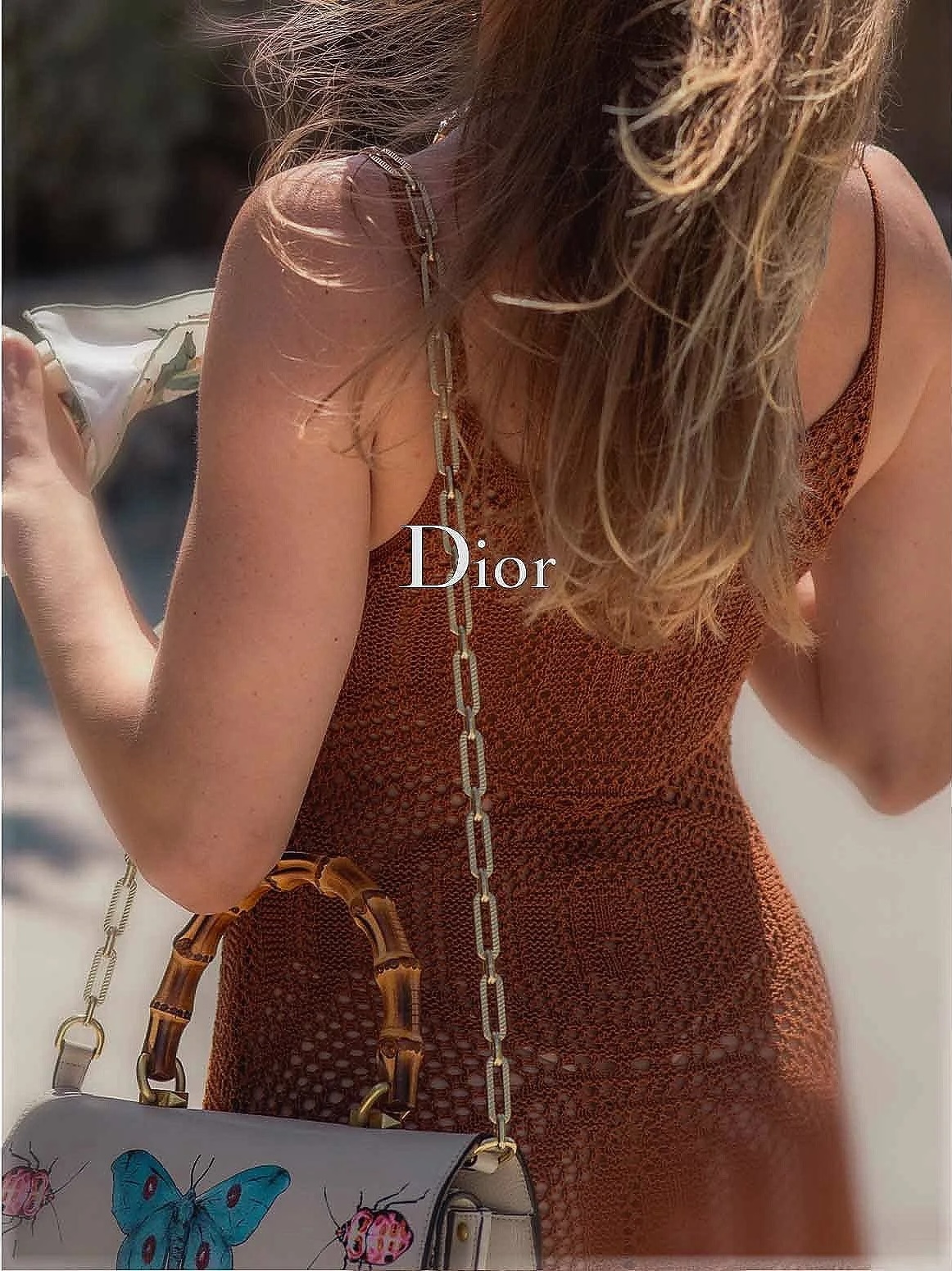
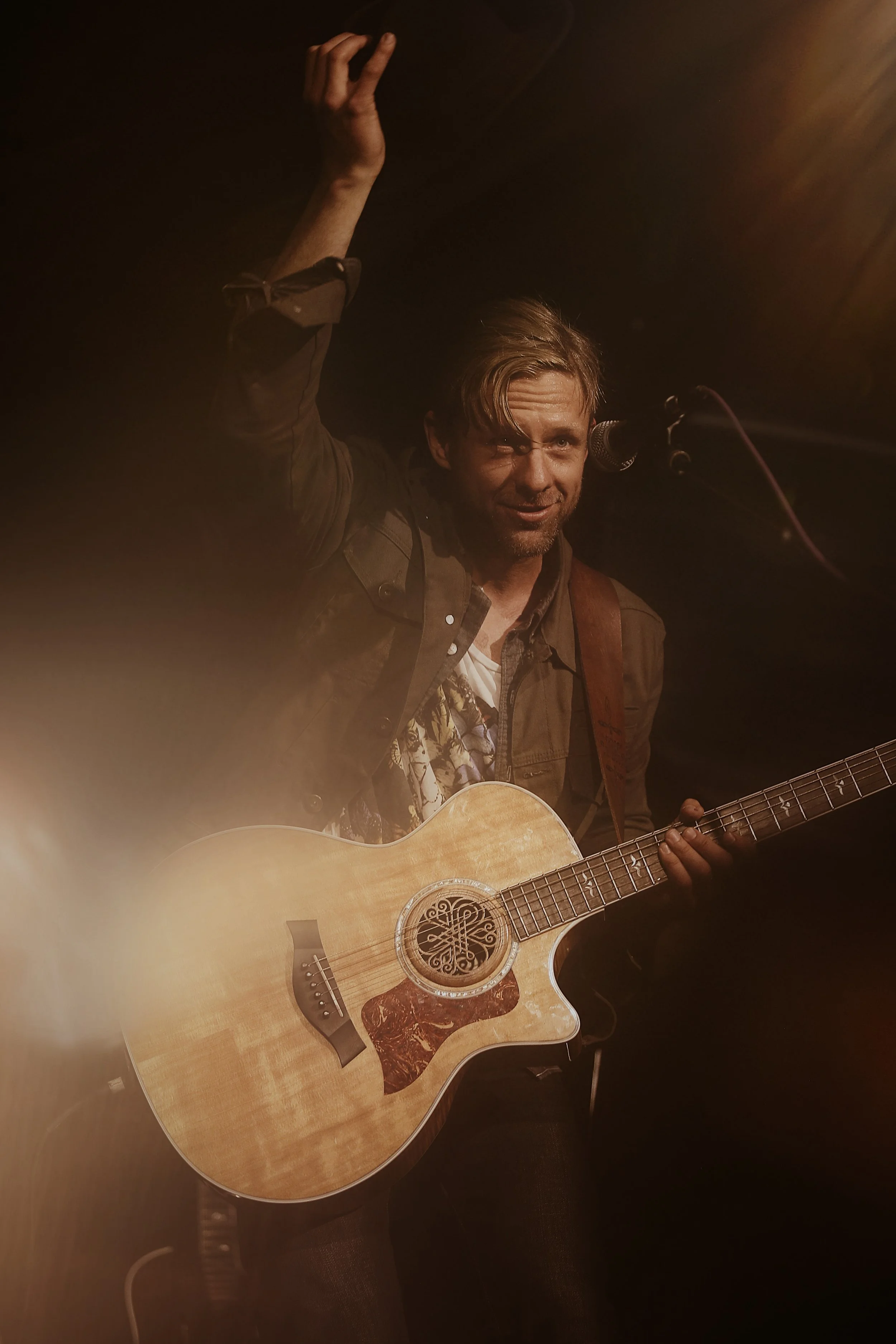
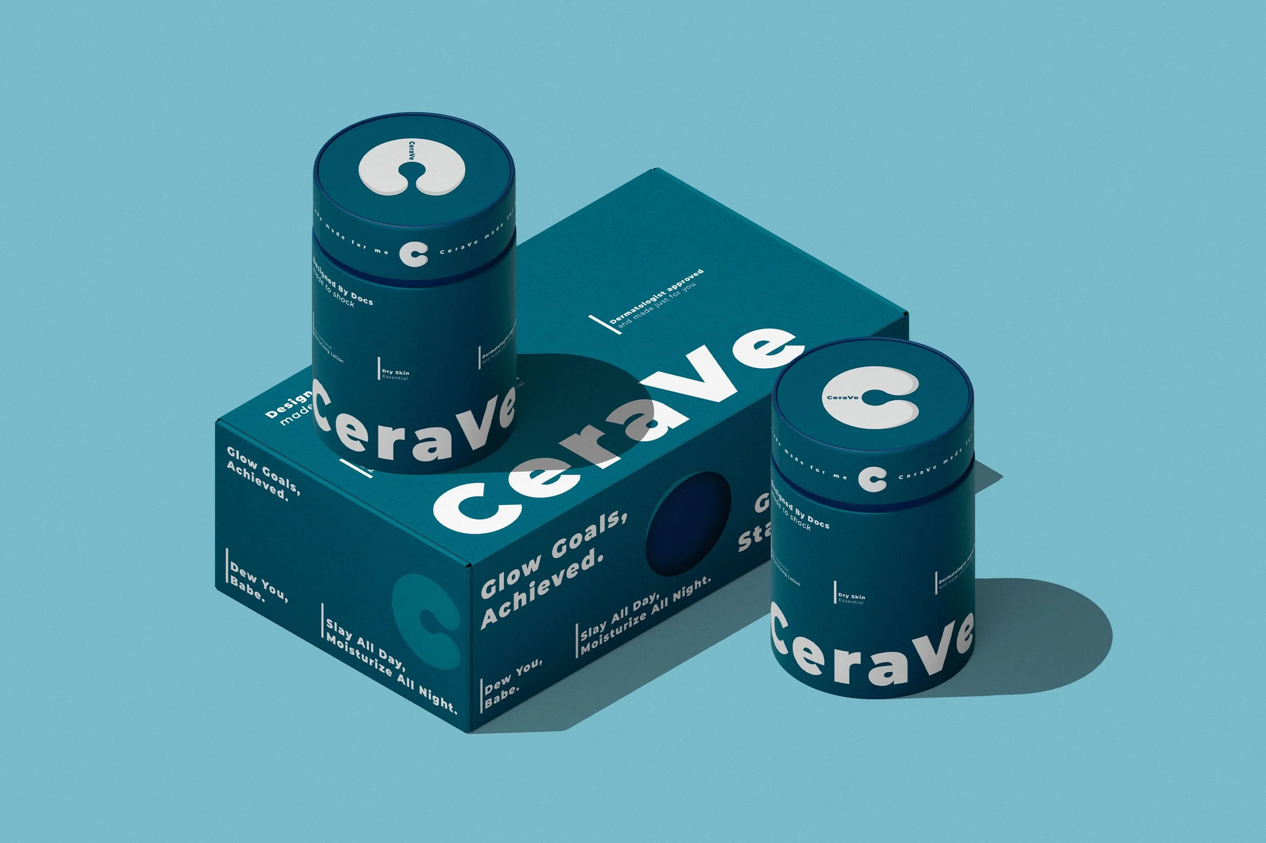
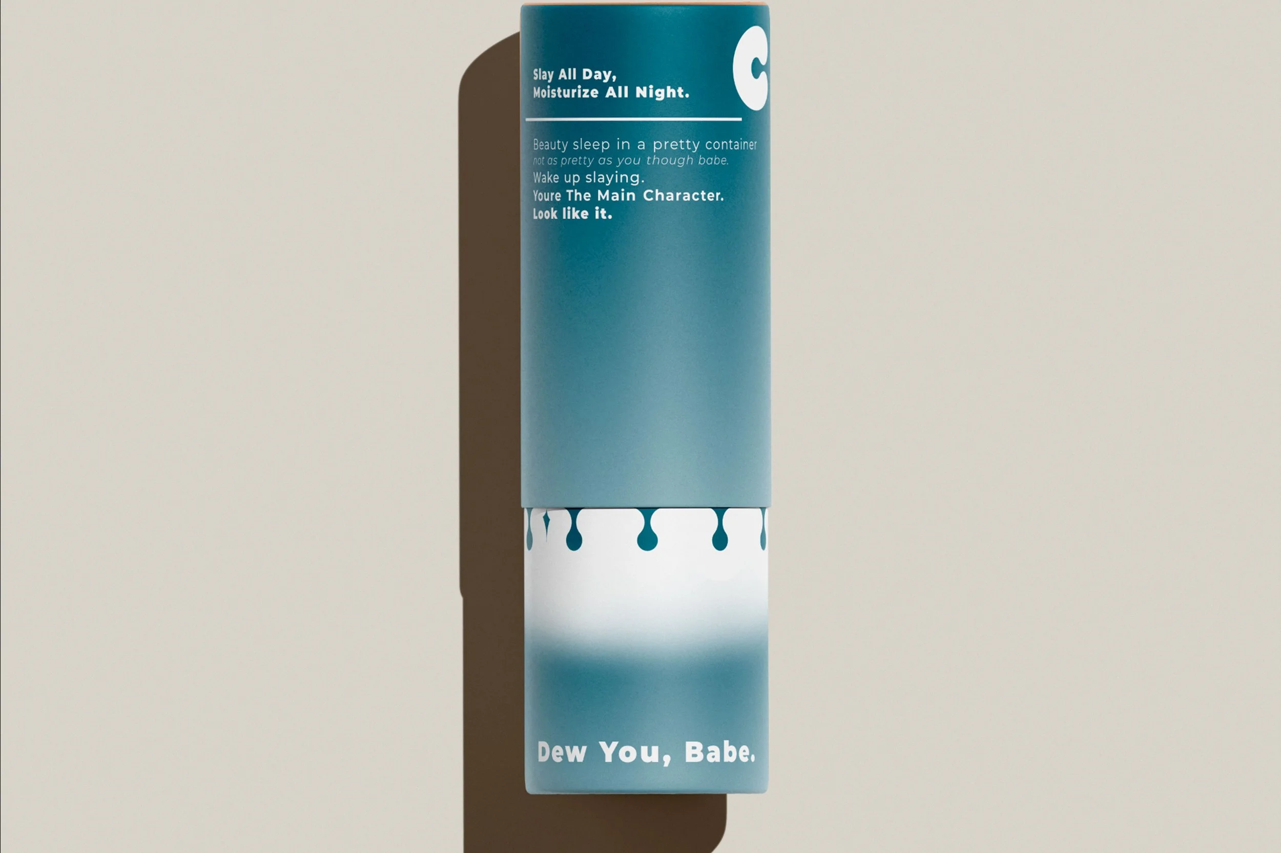
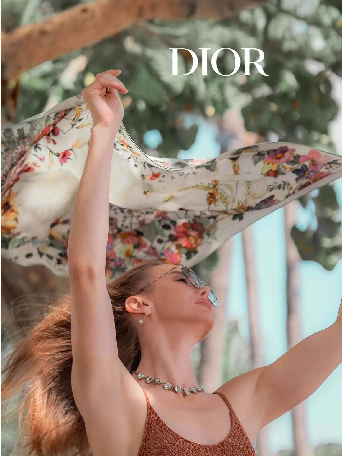
perform. Not just impress. 01 Brand Identity Logos, visual systems, and brand language built to hold up at every touchpoint — from pitch decks to packaging. Strategy-first. Built for growth. View Work → 02 Video Production Cinematic brand films, social content, and campaign video that makes people stop scrolling and actually watch. Original. In-house. Built to convert. View Work → 03 Motion & Ads Creative Animation and motion design that turns complex ideas into clear, compelling visuals — across social, connected TV, and digital OOH. View Work → 04 Marketing & Copy B2B and DTC copy that sounds like you on your best day — sharp, specific, built to drive action. Campaign strategy and product photography included. View Work → Selected projects Work that earns attention. All Branding Marketing Video Stories Ads & Creative  Branding Dior — Brand Campaign  Video Stories Jon Foreman — On Tour  Ads & Creative Motion Campaign  Branding Dior Beauty — Editorial  Video Stories Original Brand Films  Marketing CeraVe — Brand Campaign  Ads & Creative Motion Identity Series  Branding Dew You Babe — Identity  Marketing Personal Brand — Portrait  Ads & Creative Campaign Motion Design  Branding Heart Center — Identity System  Marketing Leadership Portrait  Video Stories Jon Foreman — Live & On Film  Marketing Digital Campaign Strategy  Branding Visual Identity System  Product & Lifestyle Every frame tells
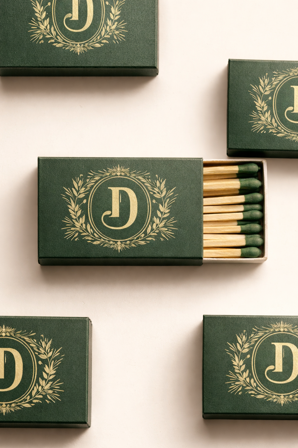
your brand's story. From product photography to lifestyle campaigns — we produce content that converts browsers into buyers and builds the visual vocabulary of lasting brands. Shot and directed in-house. Work With Us →  Motion & Video Animation that
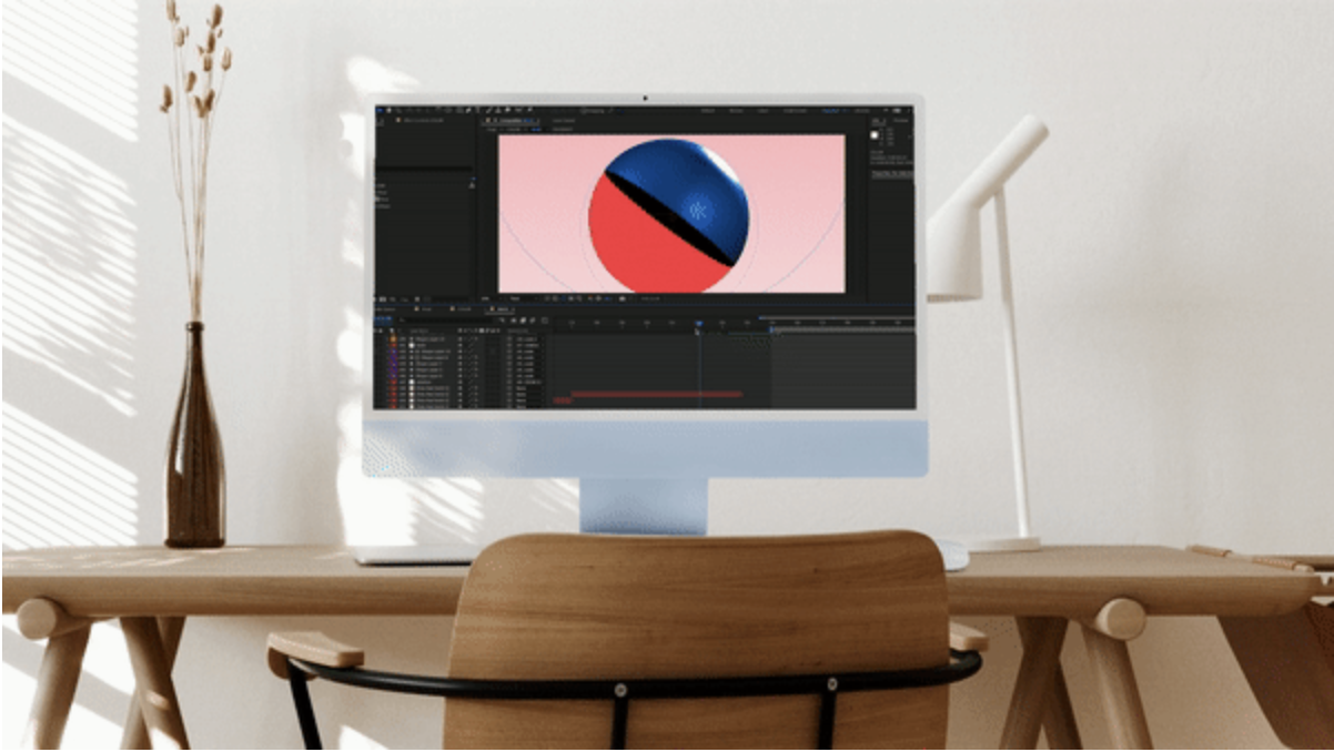
moves the needle. Motion graphics and cinematic video — from social ads to full brand films. We produce original content across every vertical: beauty, wellness, music, tech, and beyond. Start a Conversation → Why Brand Havan Most agencies are order-takers. We go upstream. You brief them. They execute. You wonder why it doesn't feel right. Before we write a line or render a frame, we learn your voice, your customer, your category. Then we build creative that earns attention — not just fills a content calendar. We've been doing this since 2010. We know the difference between work that looks good and work that performs. Strategy before execution. We learn your customer, voice, and category before opening a single file. One team. Full service. Video, motion, brand, and copy — all from the same studio. No handoffs, no translation loss. Built for growth. We've partnered with founders and Fortune 500s since 2010. We understand the business behind the creative.   Social proof Brands We've Helped Grow After our brand refresh with Brand Havan, our pitch deck close rate increased significantly. They didn't just make it look better — they made us sound like who we actually are. Founder — Growth-Stage DTC Brand We'd worked with bigger agencies before. Nobody went as deep into our brand before picking up a camera. The final video felt like us on our best day. CMO — B2B SaaS Company Selected Clients & Collaborations Dior CeraVe Switchfoot Heart Center Dew You Babe Let's build something Ready to Build
Something Worth
Remembering? Whether you're launching something new, repositioning an existing brand, or just tired of creative that doesn't move the needle — we should talk.

No pressure. No pitch deck. Just a real conversation about what you're building. Book a Free Discovery Call → Brand Havan Full-service creative studio for founders and growth-stage brands who need someone to own the creative execution — not just execute tasks. Services • Brand Identity • Video Production • Motion & Ads Creative • Marketing & Copy Work • Our Work • Selected Clients • Our Approach Contact • Start a Project • Book a Discovery Call © 2025 Brand Havan. All rights reserved. brandhavan.com Instagram LinkedIn TikTok